- Packages I will use to read in and plot the data
- Read the data in from part 1
Interactive Graph
Start with the data
Group_by“Food Group” so there will be a “river” for each Food GroupUse
e_chartsto create an e_charts object with Year on thex axisUse
e_riverto build “rivers” that containCaloriesfor each food group. The depth of each river represents the amount of calories for each food group.Use
e_tooltipto add a tooltip that will display based on the axis valuesUse
e_titleto add a title, subtitle, and link to subtitleUse
e_themeto change the theme toroma
usa_diet2  %>%
  group_by(`Food Group`)  %>%
  e_charts(x = `Year`)   %>%
  e_river(serie = `Calories`, legend=FALSE)  %>%
  e_tooltip(trigger = "axis")  %>%
  e_title(text = "America's Daily Caloric Intake Composition",
          subtext = "(breakdown based on the year's daily avg. calorie intake) Source: Our World in Data",
          sublink = "https://ourworldindata.org/grapher/dietary-compositions-by-commodity-group?country=~USA",
          left = "center")  %>%
  e_theme("roma")
Static Graph
Start with the data
Use
ggplotto create a new ggplot object. Use aes to indicate that Year will be mapped to the x axis; Food Group will be mapped to the y axis;Calories will be mapped to the color variablegeom_pointwill display # of Calories with the intensity of the color representing the amount in each Food Group with relation to the Year. Set size of point to1.2.scale_fill_discrete_divergingxis a function in thecolorspacepackage. It sets the color palette to roma and selects a maximum of 12 colors for the different regionstheme_classicsets the themetheme(legend.position = “bottom”)puts the legend at the bottom of the plotlabssets the y axis label,fill = NULLindicates that the fill variable will not have the labelled Region
ggplot(usa_diet2, aes(x=Year, y=`Food Group`, color= `Calories`)) + geom_point(size = 1.2) +
colorspace::scale_fill_discrete_divergingx(palette = "roma", nmax =11) +
theme_classic() +
  theme(legend.position = "bottom") +
  labs( y = "Food Groups")
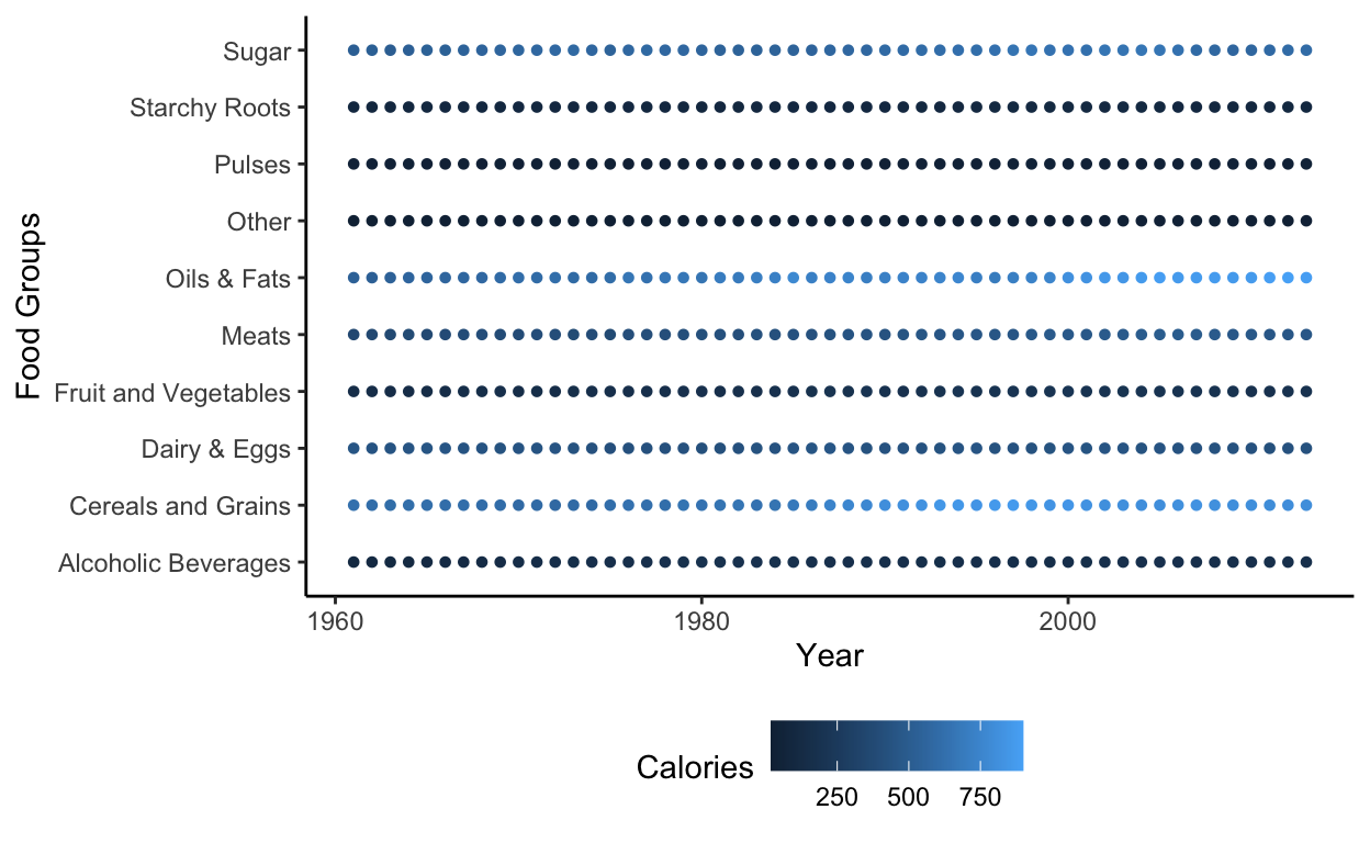
These plots show a steady in total caloric intake since 1961 and the Food Groups: Oils & Fats and Sugar still among the biggest portions of one’s daily intake. Although, since 1961 the amount of calories that Cereals and Grains takes up, has steadily grown.